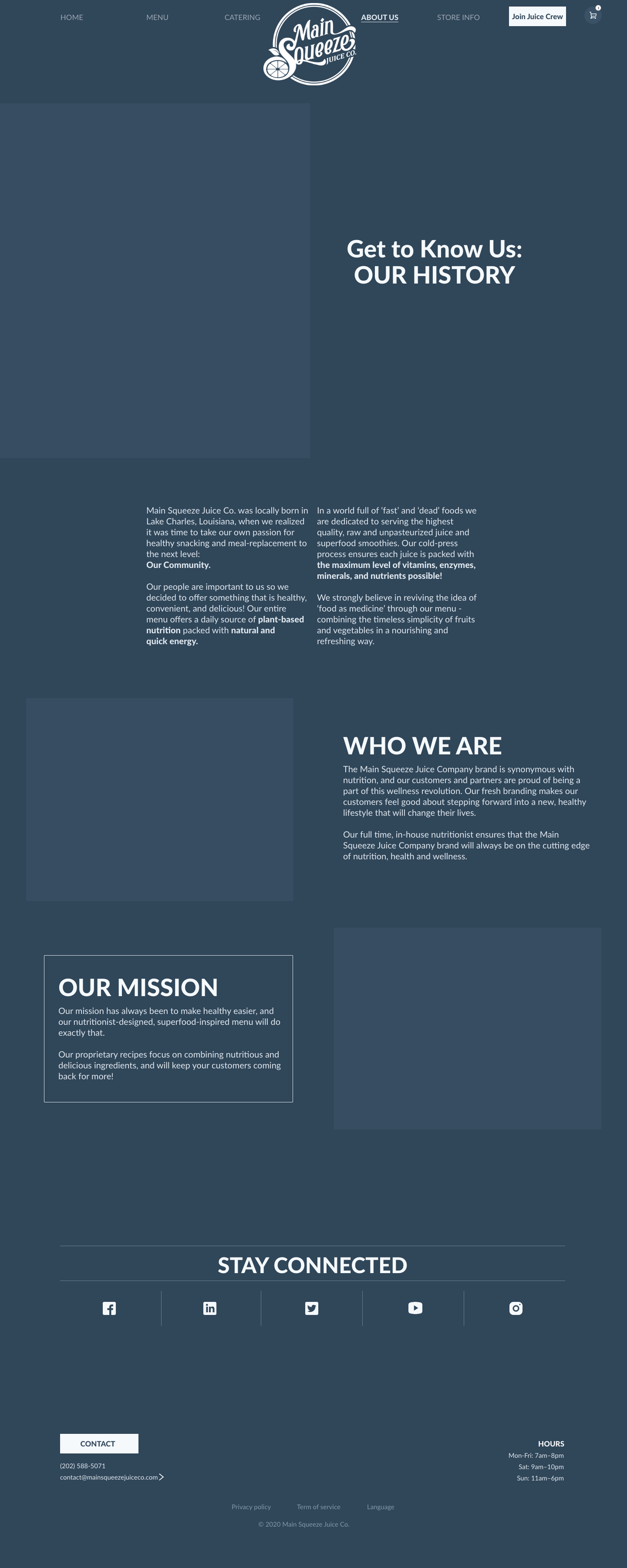
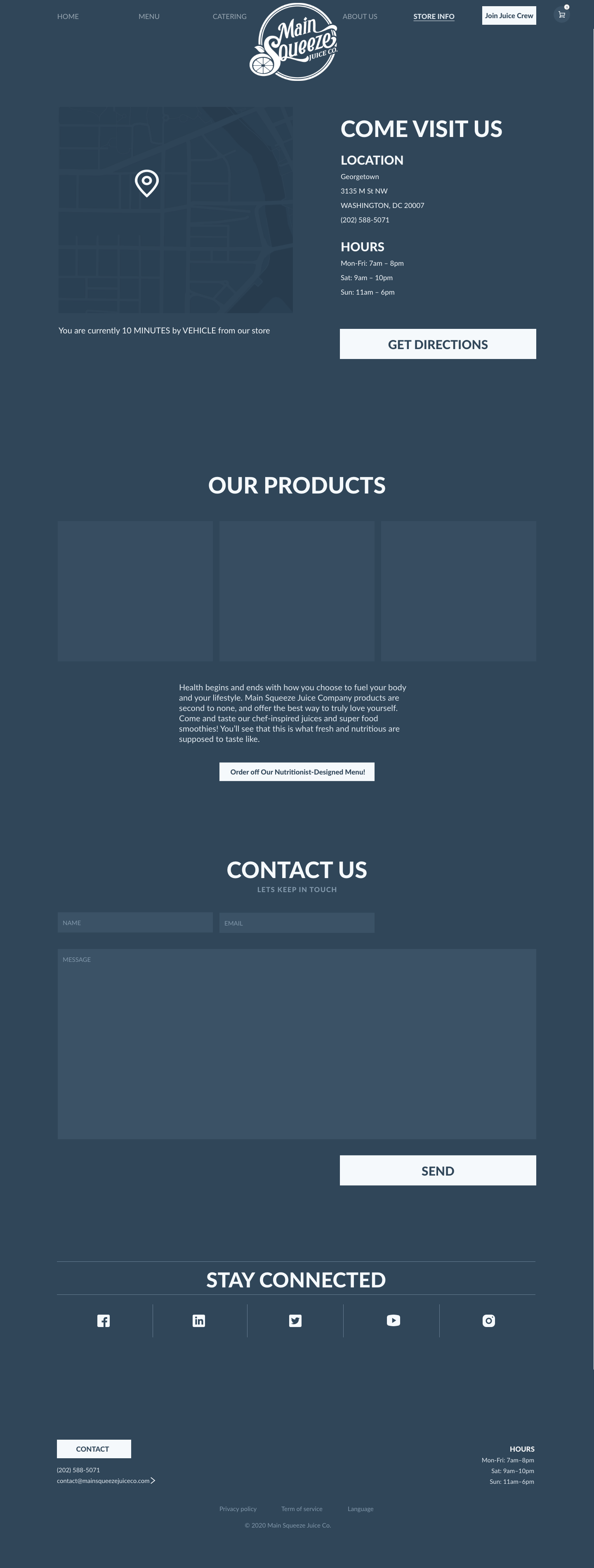
Main Squeeze Juice Co. is a new, organic beverage bar company in the Washington, D.C. area. Their goal as a company is to have a website that advertises their products with a nutritionist-designed, superfood-centric menu. The website was designed with easy user access to nutrition information on all merchandise in order to align with the company’s health centric motto. As well, since we are still amid a pandemic, both the desktop and mobile online ordering process were streamlined. The pandemic shouldn’t stop Main Squeeze Juice Co. from establishing a loyal client base.
DURATION: 8 weeks
DELIVERABLES: full prototype, personas, site map and site inventory, wireframes, style guide, animated logo
DELIVERABLES: full prototype, personas, site map and site inventory, wireframes, style guide, animated logo

AUDIENCE
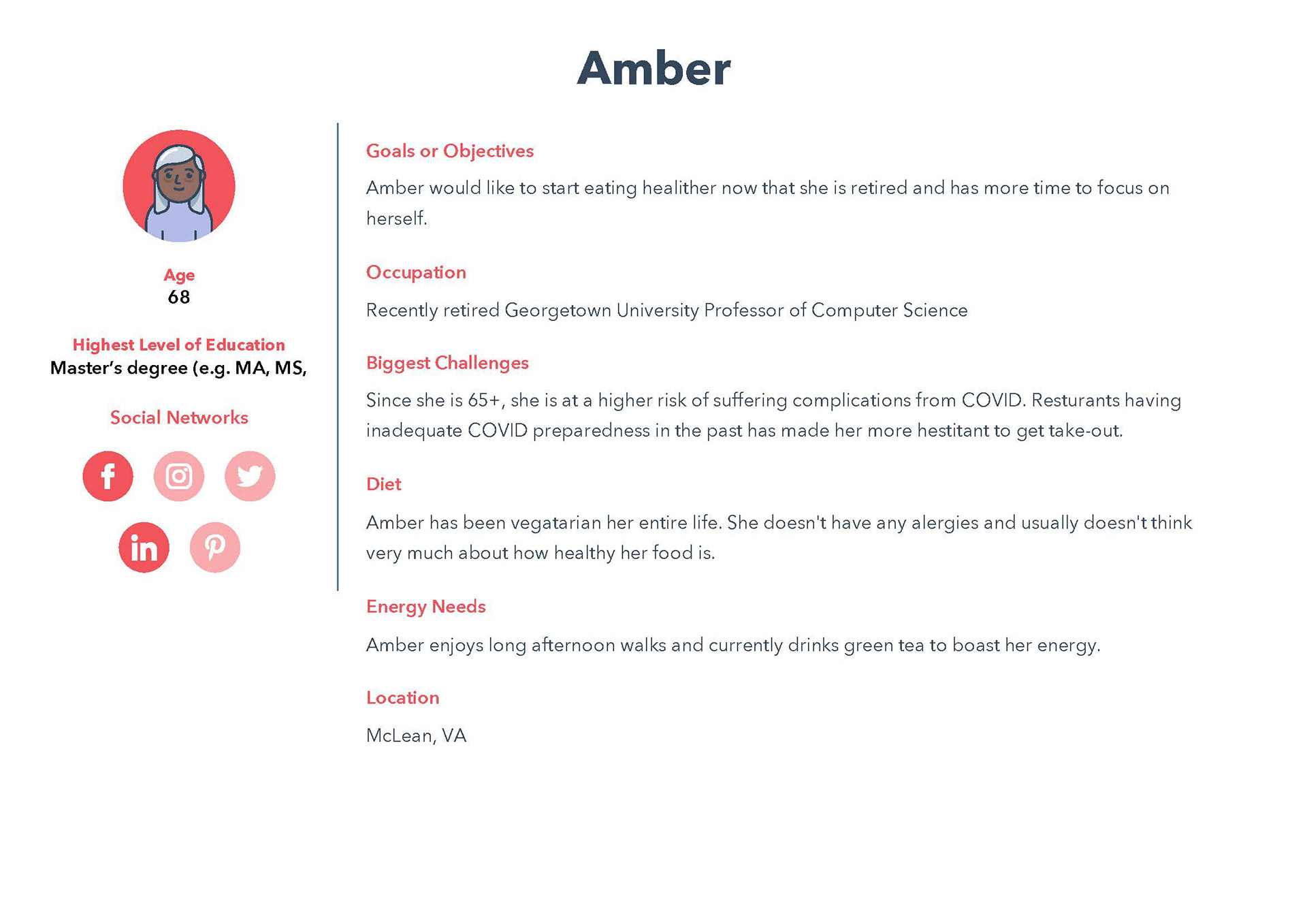
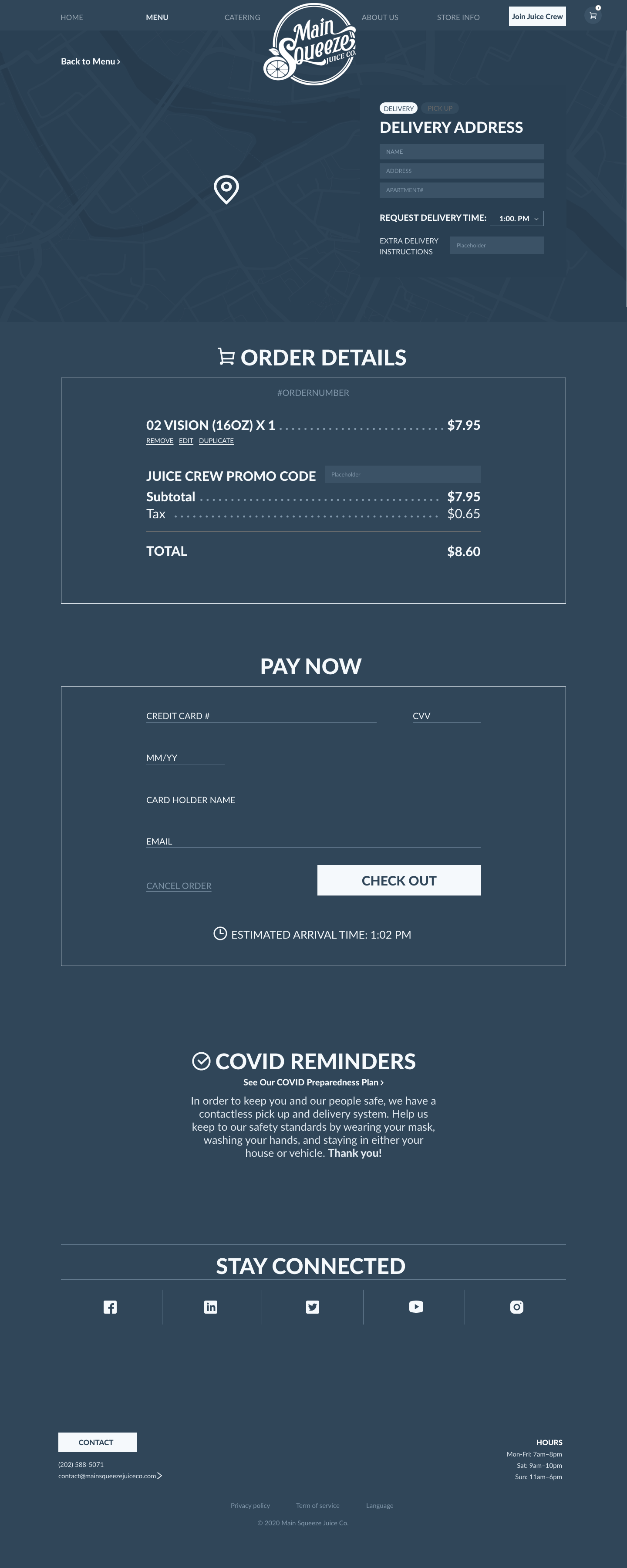
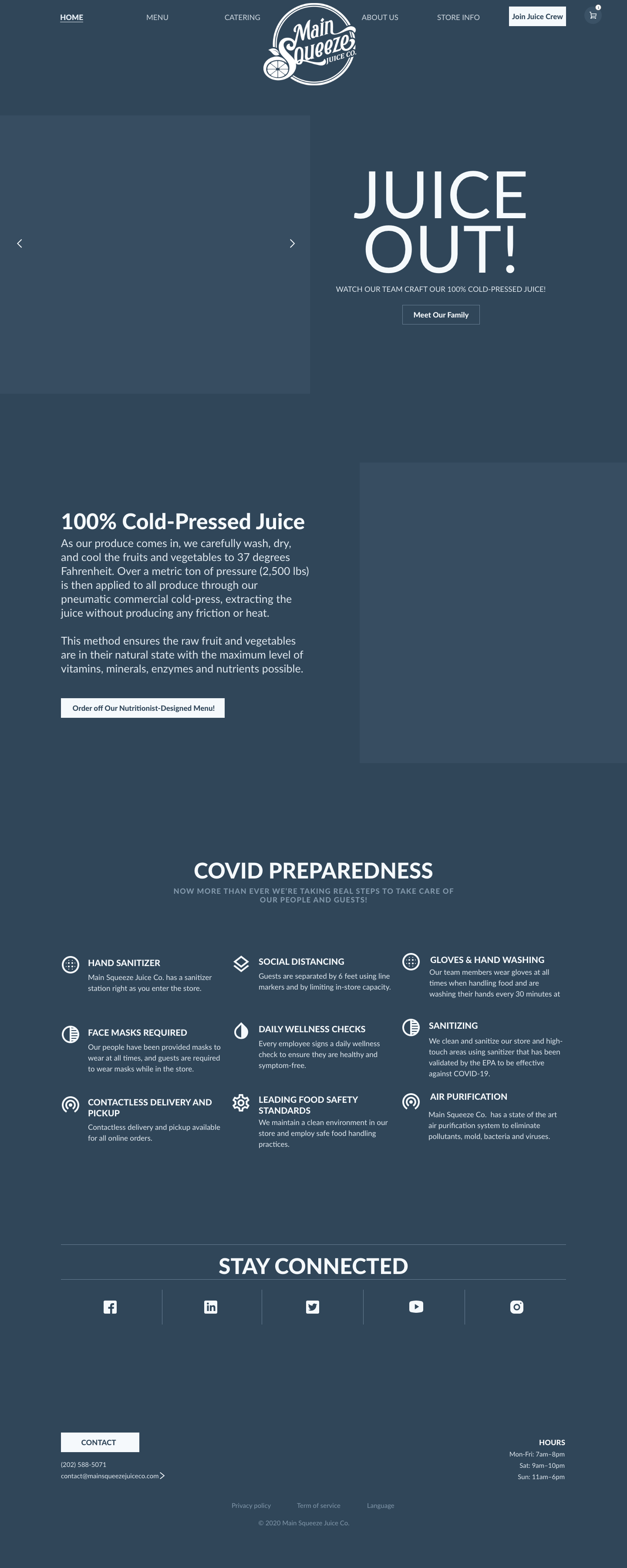
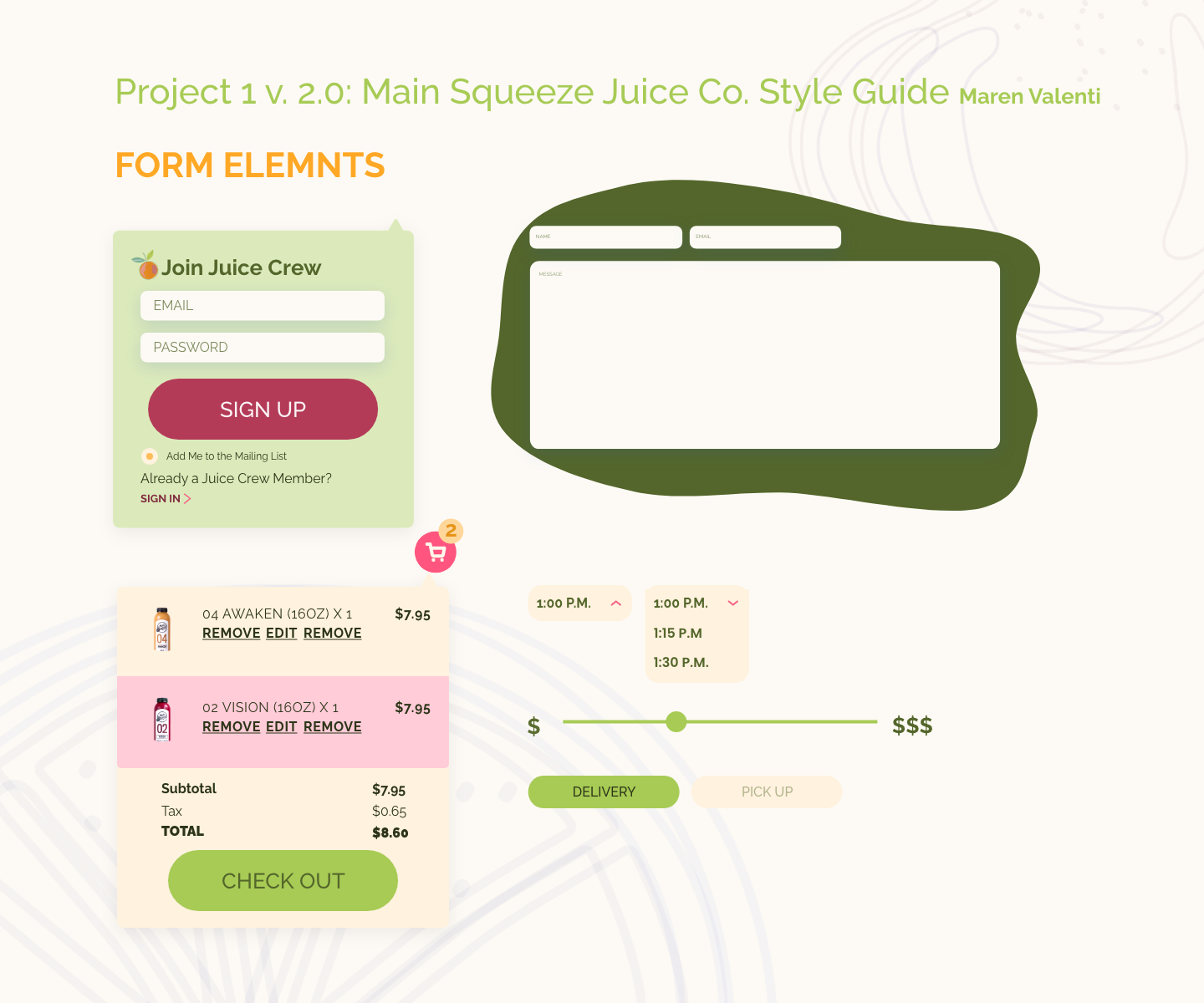
To account for persona needs several special feature elements were included. To fulfill Eli’s need for affordability, both a price slider element and discounted Juice of Month promo were included. To help with Eli’s food allergy, a select fruits element was included to assist in removing problematic fruits from the juice line up. To fulfill Amber’s needs, a substantial COVID preparedness plan is placed on the homepage and reiterated on the check-out page to ensure her safety needs are accounted for. As well, to assist in health and wellness for both personas, the easy nutrition information icons on all merchandise can help them make the best choice.
SITE MAP
Wire Frames
Both mobile & desktop






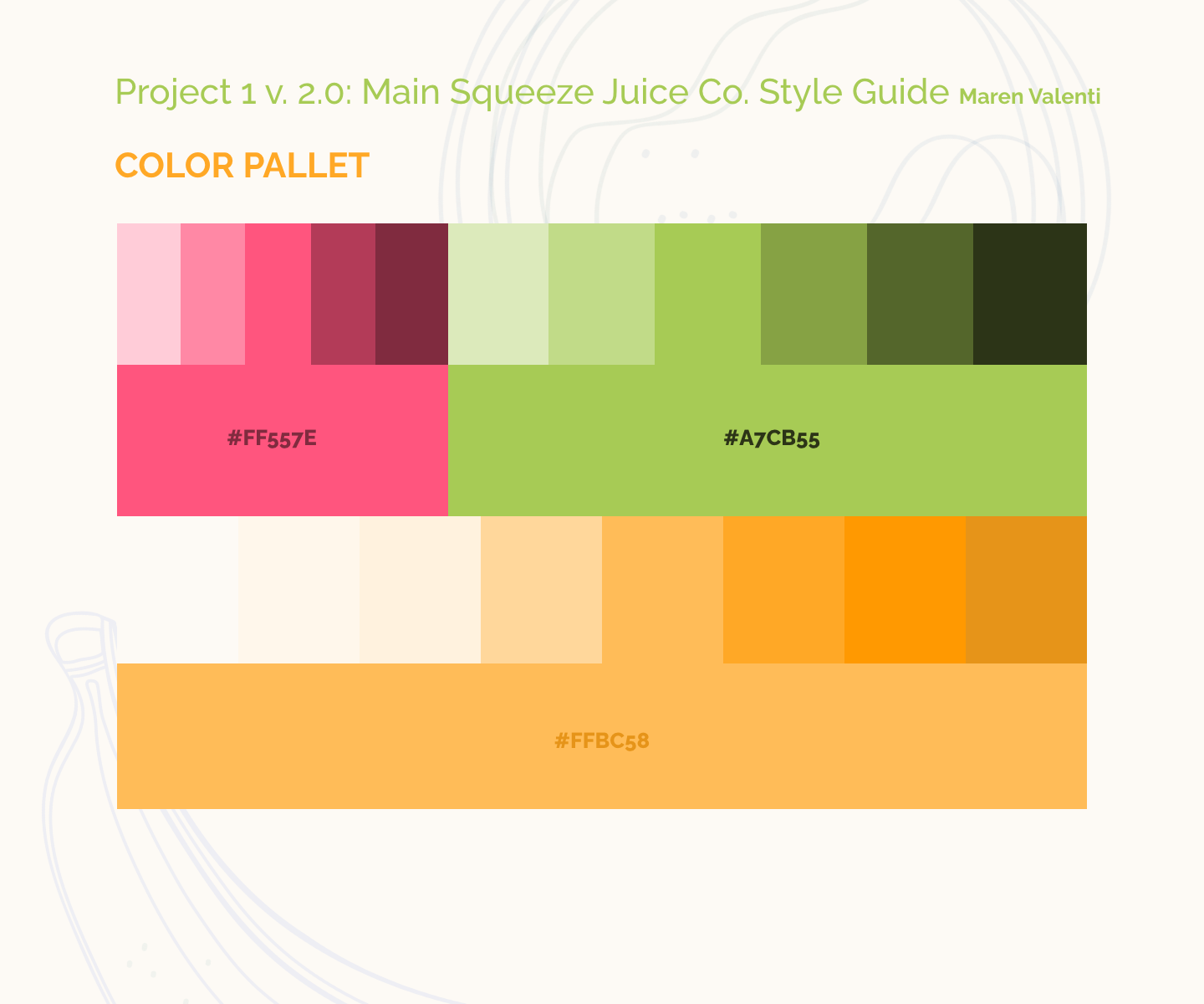
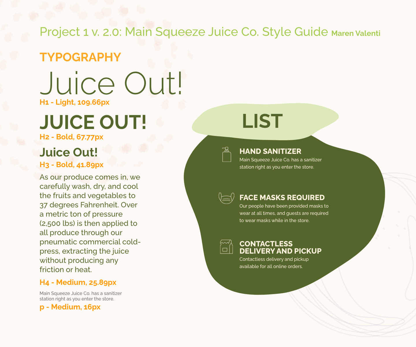
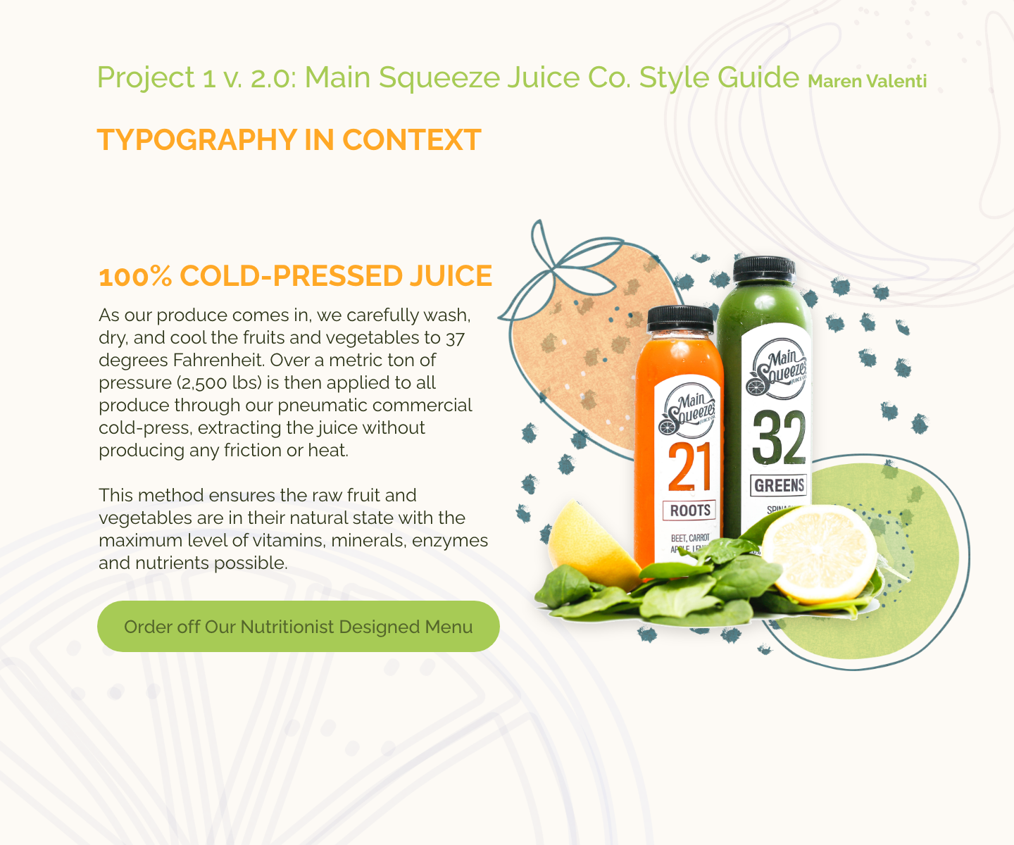
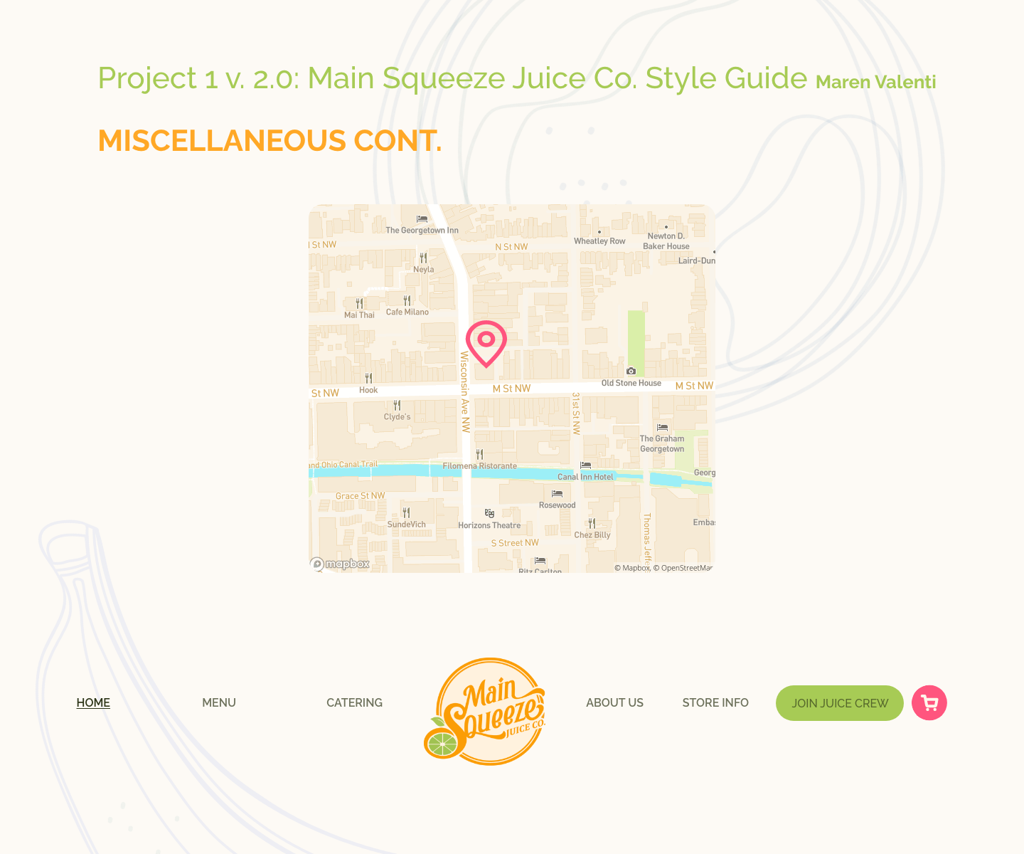
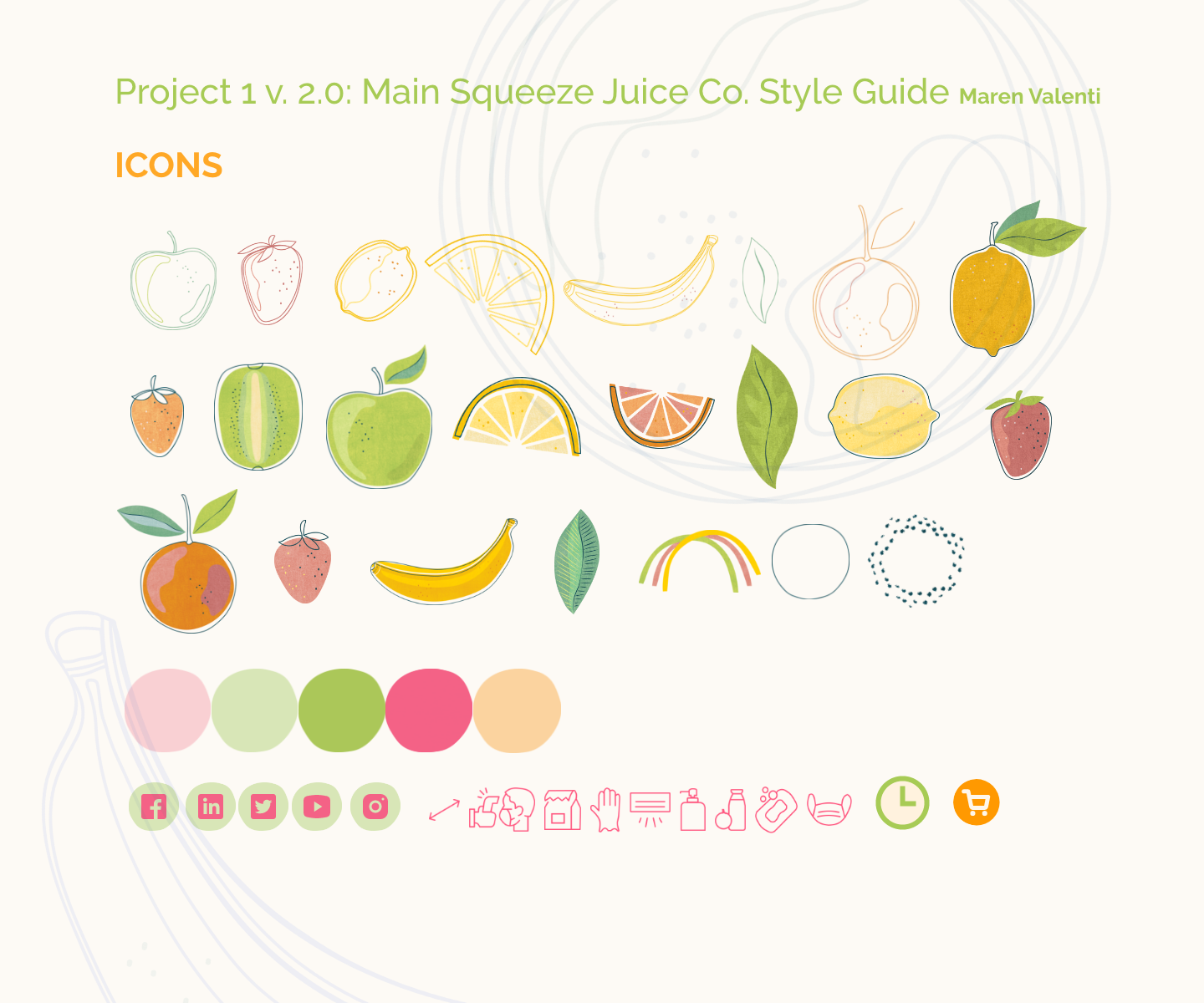
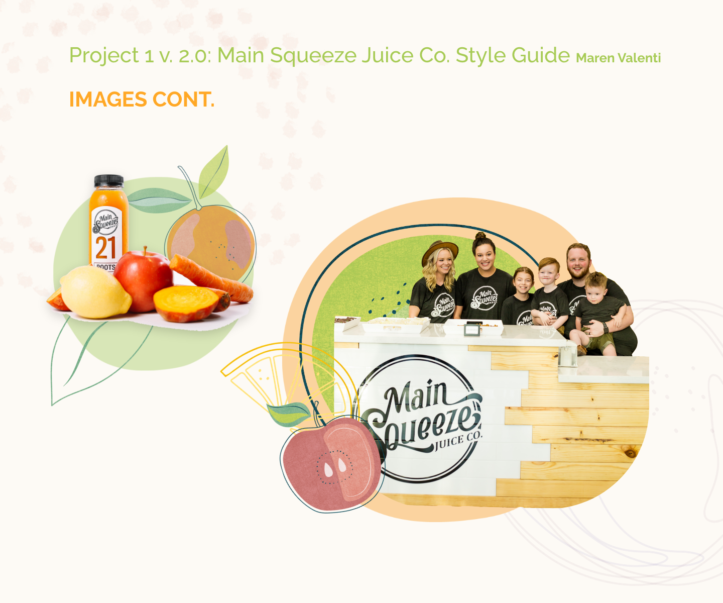
Style Guide



Animated Logo: BRand in Motion
Runner Up in Creative Quarterly 64
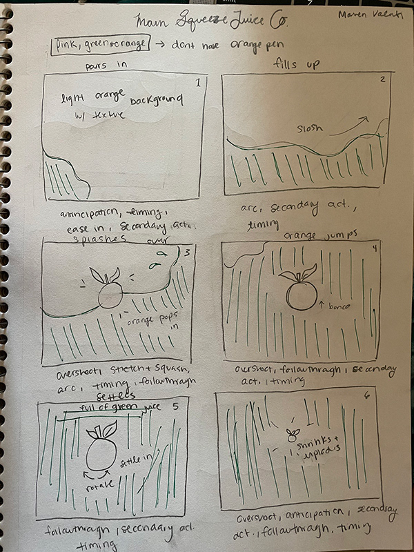
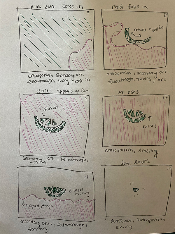
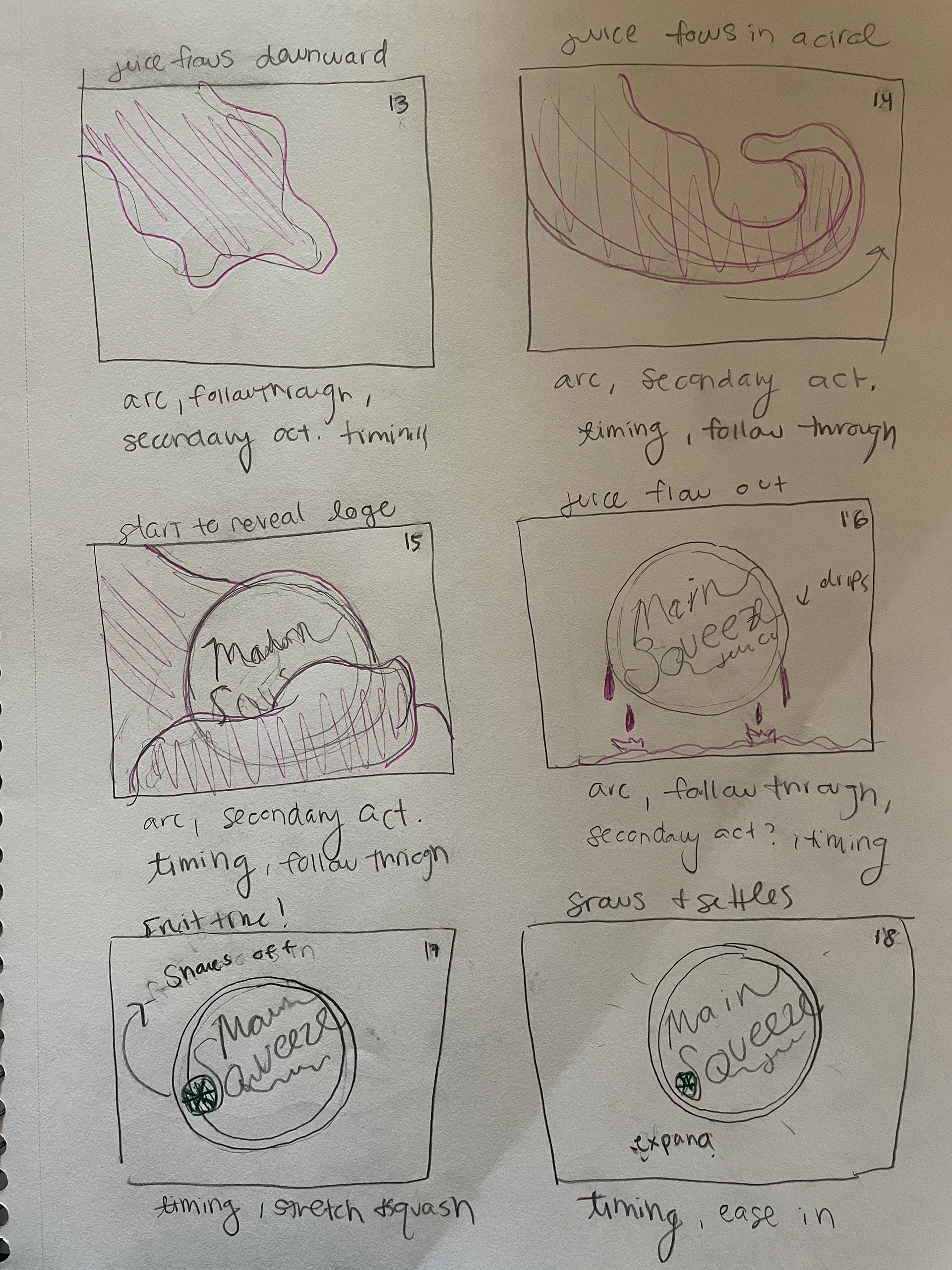
I wanted the fun and fresh feel of the website to continue into the animated logo. Using elements from the style guide and juice itself as inspiration, I made short, energetic "brand in motion" motion graphic.
STORYBOARD
